
In order to minimize such variations, the International Standards Organization established a standard called ISO 3664. The standard dictates that when viewing prints, a light source that replicates the D50 light source should be used.
Note that D50 is similar in concept to but differs from D65 which is used as the standard daylight illuminant.
What is D50?
D50 is a theoretical light source that approximates "warm daylight" and follows the CIE standard. It is defined by a theoretical light spectrum as shown below.
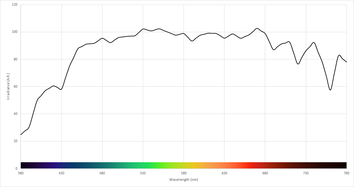
The resulting xy chromaticity coordinates of this spectrum are (0.34567, 0.35850).
The color temperature of this chromaticity point is 5003K.
The closer a light source is to this D50 light spectrum, the closer it is to being a true D50 illuminant. Since D50 is a theoretical light source, however, it is not possible to actually fully achieve a light source that perfectly replicates the D50 illuminant. Even natural daylight, in practice, would not absolutely replicate the D50 illuminant.
It is important to note that not all 5000K light sources have the same chromaticity as an acceptable D50 light source. The reason is that 5000K is a correlated color temperature, while D50 is an absolute chromaticity point.
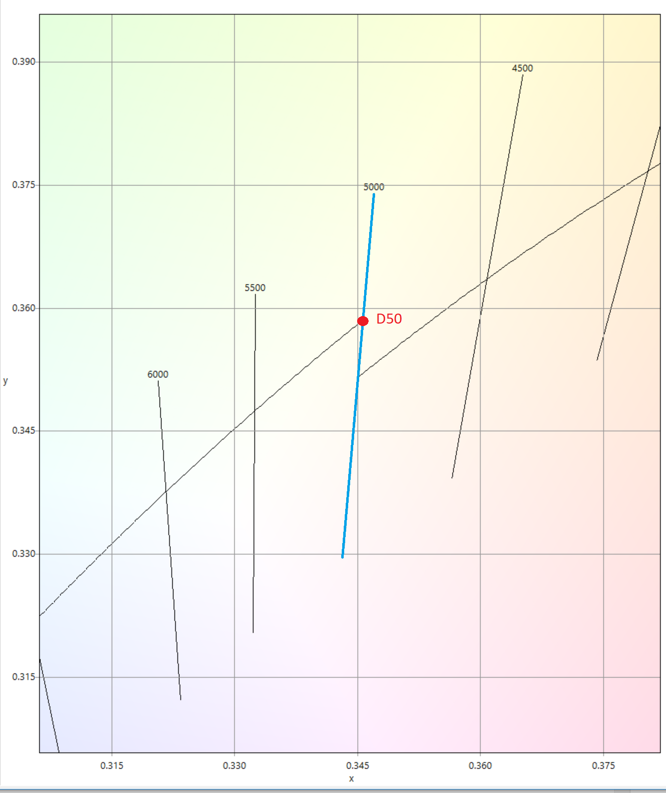
Furthermore, it is also important to note that not all light sources that meet the D50 chromaticity target of (0.34567, 0.35850) are necessarily acceptable D50 illuminants. The reason is that due to a phenomenon called metamerism, different light spectra can result in the same apparent light color, despite creating vastly different results in color rendering.
What is the difference between D50 and D65?
As we mentioned earlier, D50 is not considered a standard daylight illuminant, but is nonetheless used widely in graphic arts and printing. Although both D50 and D65 are considered natural daylight simulators, there are some significant differences when it comes to the spectrum as well as color point.
First, with respect to the spectrum, it is evident that the D65 spectrum is more blue-biased than D50. The amount of violet, blue and green colors is quite a bit more than yellows and reds.
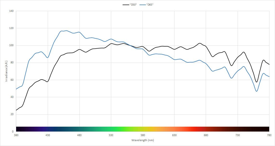
We can make intuitive sense of this when we consider that D65 is natural daylight (not sunlight) on a clear day, which is influenced very strongly by the blue sky.
Next, we take a look at the chromaticity points. When plotting the CIE 1931 xy chromaticity points, we can see a significant color difference - in terms of MacAdam ellipses, the distance is approximately 19 steps, and in terms of Delta E their color difference is approximately 21.
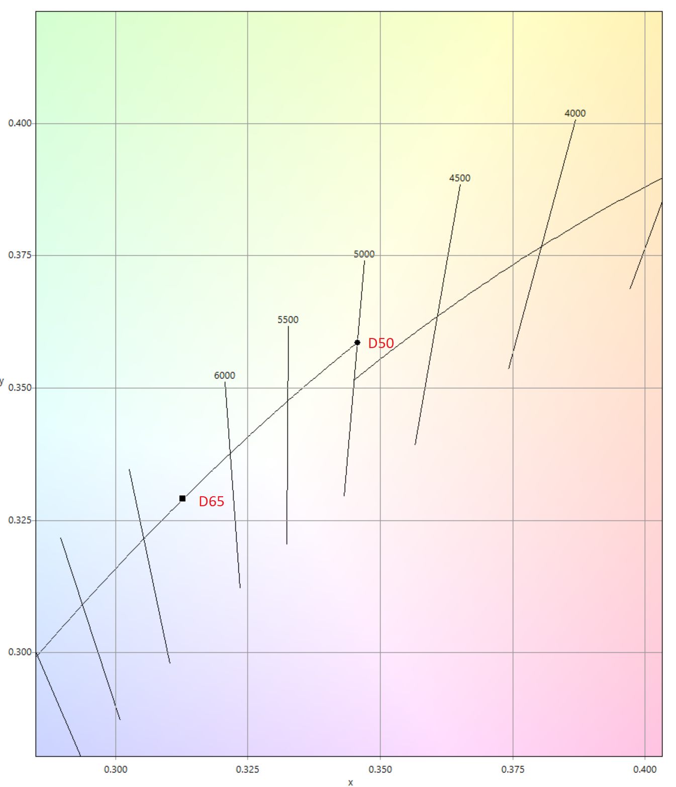
Subjectively, D50 will appear "yellower" when compared to D65.
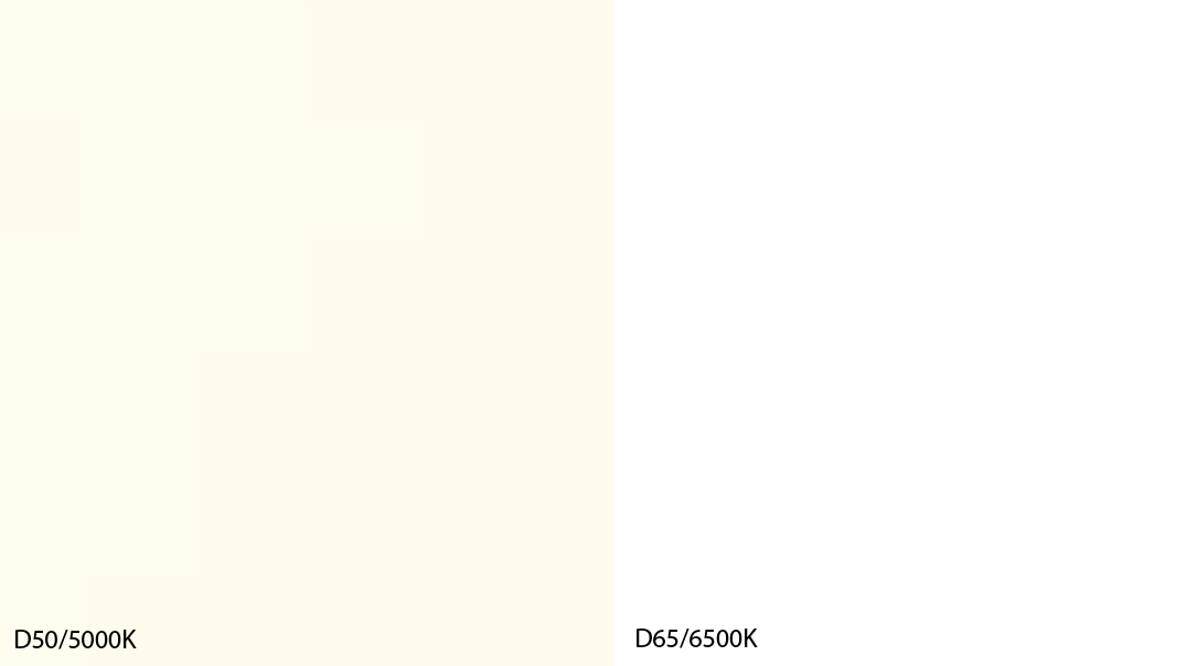
Most modern LCD monitors are calibrated to D65, so the right swatch (above) should appear as pure "white" - while the D50 whitepoint would be calibrated to the left swatch (above).